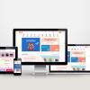
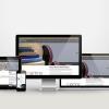
Duysak Hearing Aids is a trusted brand in hearing health for many years. The DUYSAK brand, which wants to better publicize its services and reflect its reliable service understanding in digital, decided to work with us in this sense. We set out with this perspective. Our priority was to present information in a simple flow. Because users looking for hearing aids need clear information. Therefore, technical content had to be easy to read. In addition, the site design had to be created with visitors with a high average age in mind. We opted for large fonts, clear colors and clean navigation, an approach that significantly improved the user experience.
The new structure provided a strong digital showcase for Duysak Hearing Aids. Interface details were carefully organized. Each category has an organized structure that guides the user in the right direction. In addition, product pages became more descriptive. Thus, visitors found the device they were looking for faster. As a result, the brand gained a calmer, clearer and more professional identity on digital. This identity provided a reassuring experience for both existing users and new visitors.
Duysak Hearing Aids Transformation Process required a planned and careful work due to the sensitivity of the sector. Each step was shaped according to the needs of the brand. This process strengthened both the digital appearance and the functional structure.
Corporate Website Design and Software
- We completely re-planned the site structure.
- We have unified all pages in a fast, clear and simple layout.
- We have built a clear information architecture that leads to device categories.
- The focus of the design was on accessibility.
- On the software side, we have prepared a secure, fast and modern infrastructure.
- We strengthened mobile compatibility and ensured smooth streaming on all screens.
- We simplified the administration panel for easy use.
User Interface Design (UI)
- We used readable typography.
- We chose colors that are suitable for eye health.
- We simplified the menus and eliminated confusion.
- We continuously improved the flow through user testing.
Google Map Map Search Module Integration
- Users can now quickly find the nearest branch on the map.
- We provided more practical use on the mobile interface.
- We have placed the locations of the branches in a clear and understandable way.
Product and Product Category Display in Catalog Mode
- We presented the products in a simple layout.
- Categories are clearly separated.
- We optimized the visuals and made the decision process easier.
This transformation has created a strong, modern and accessible digital structure for Duysak Hearing Aids.
Duysak Hearing Aids digital and visual solutions package was specially created to increase the brand’s power in the digital world. This package includes a simple web design that allows users to navigate easily. The design language was shaped in accordance with the professional stance of the brand. Because it’s important for hearing healthcare brands to appear clear and trustworthy. The user experience was also enhanced by the clear and organized presentation of technical content.
The interface design prepared as part of the package helped visitors navigate the site without difficulty. The menu structure was simplified. The visuals used on the product pages were professionally optimized. Thus, each device was introduced more clearly. In addition, the Catalog Mode offered detailed product information to the user without including prices. This approach is an ideal solution for brands providing consultancy services.
Google Map Map Search Module integration enabled visitors to reach the nearest branch quickly. This integration made the customer journey shorter and more practical. When all these solutions were combined, Duysak Hearing Aids reached a much stronger position in the digital field.